Define
Sex education is a huge umbrella term for a variety of health related topics. In order to formulate a direction, I needed to find out where the main issues lie and what is already being done to combat them.
Research
My initial research revealed just how poor the sex education system currently is. It also allowed me to define what the goal or "golden standard" of sex education is considered as; comprehensive sexual education.
Harmful resources are being spread.
Kids are being introduced to sex at a younger and younger rate as resources like television, social media, movies, the internet, and pornography are becoming more accessible.
Schools don't put enough focus on quality sex ed.
Schools spend 13.5 hours on sex education over the course of 8 years. The material being taught is also unregulated with no nationalized curriculum.
Students are being set up for failure.
Students have no foundational knowledge of sex and health from schools, so they're viewing the harmful resources as education.
Interviews
Although I had my own experience with sex education in schools, and I knew what my friends and I had talked about in passing, I needed to know more about the education system and impact from multiple angles. By interviewing both students and educators, I was able to discover how different roles were being affected by the problem.
"Some resources exist, but they're so disconnected and students don't know about them. It's difficult because theres no cohesive source of 'correct' information, so students turn to the internet instead."
-Melissa Meadows (She/Her),
Education Director of The Virginia League for Planned Parenthood
"A lot of untaught content I try to introduce casually everyday, consent, relationships, etc."
-Sara S. (She/They), Educator
“[Sex education] was awkward and uncomfortable because it was very heteronormative; hyper masculine with a room full of confused teenage boys.” No one took it seriously.
-Anonymous (He/Him), Student
" I felt like there was something wrong with my body. I was so ashamed for the longest time and didn't want to talk about it with anyone. I truly hated myself. Over my discharge!"
- Anonymous (she/her), Student
Personas & Journey Maps
I needed to define and create multiple personas in order to encompass different needs as well as determine touch points where I could potentially intervene. These ranged from broader life and developmental timelines, to more niche situations.


Ideation
Figuring out how the programming would function was a huge factor in this project. I needed to figure out touch points and needs in order to create some sort of framework to justify how my solution functions.
Comparative Journeys
Something else I also needed to do was to create and compare parallel journeys in order to determine how my solution could solve different needs at similar touch points.


Needs
Through my research, I identified 3 major factors that needed to be included in my solution. These grounding factors influenced every design decision moving forward.
Relevant Information
Through AI technology, lessons can be curated following the student's life timeline.
Digestible Information
Information needs to be presented in language the student understands.
Appealing Information
Students need to want to use this product.
Visual Identity
HUM needed to appeal to students of all ages, so I needed to keep the design exciting yet neutral enough to appeal to a wider audience.
Naming
I wanted the name to be something fun yet simple. I chose to do a play off of "the birds and the bees" by using the name of a pollinating bird; the hummingbird. I played around with the idea of calling it "Hummingbird" and did some user testing. I got similar feedback across the board.
"It sounds very professional, I wouldn't expect it to be something made for kids."
"It's too long."
HUM rolled off the tongue better, and added a hip flair to the hummingbird concept.
"HUM also sounds like the 'hmm,' you make when pondering a question."
"This sounds fresh and inviting, and could live on screens a lot better."
Colors & Fonts
I pulled the colors directly from the colors found on hummingbirds. I wanted bold, fun colors and fonts to add to the youthfulness of what HUM represents.


Logo
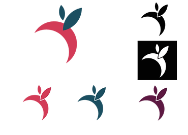
I was able to come up with the logo by simplifying the body of a hummingbird. I played with many iterations, but eventually settled on something that felt both playful and educational.


Prototyping
For the purpose of this project, I didn't need a completed product, but instead I needed screens to highlight important functions and touch points.
Initial Prototype
The first screens that I created were made with the intention to get as much information across as possible. This leaned heavily into the educational aspect of HUM, and focused primarily on showcasing how different user journeys would look.


The feedback I received here reflected what I was already thinking. The bones were there, but the execution fell short.
"Visually, this could look more interesting. It's too text heavy for an app made for kids. I could see older kids maybe wanting to read through this, but you've lost the attention of a 12 year old."
"I think the concept is there. I can see how different journeys produce different results. I think there's an opportunity to bring in more personality here."
Final Screens
I wanted the app to be reflective of learning apps like Duolingo, and mindfulness apps like Headspace. The wireframe needed to be both simple and interesting, while having enough functionality to cover the 3 principles in mind; relevant, digestible, and inviting.
So I didn't repeat the same design mistakes as last time, I divided my app into 4 major sections (check in, chat, learning, and journal) to better separate and define the screens I wanted to show.


